Hello folks!! In this article, we'll learn about how to design component APIs for your design system and make it reusable across different teams, fulfilling all the use cases in the most optimised way and following the design principles guidelines.
We'll look into the different approaches to building component APIs.
🎯 Component Requirements
While building a component, we'll consider into mind the different use cases and as we add more functionality, the complexity of components increases. So before building future-proof components let's first explore all the use cases:
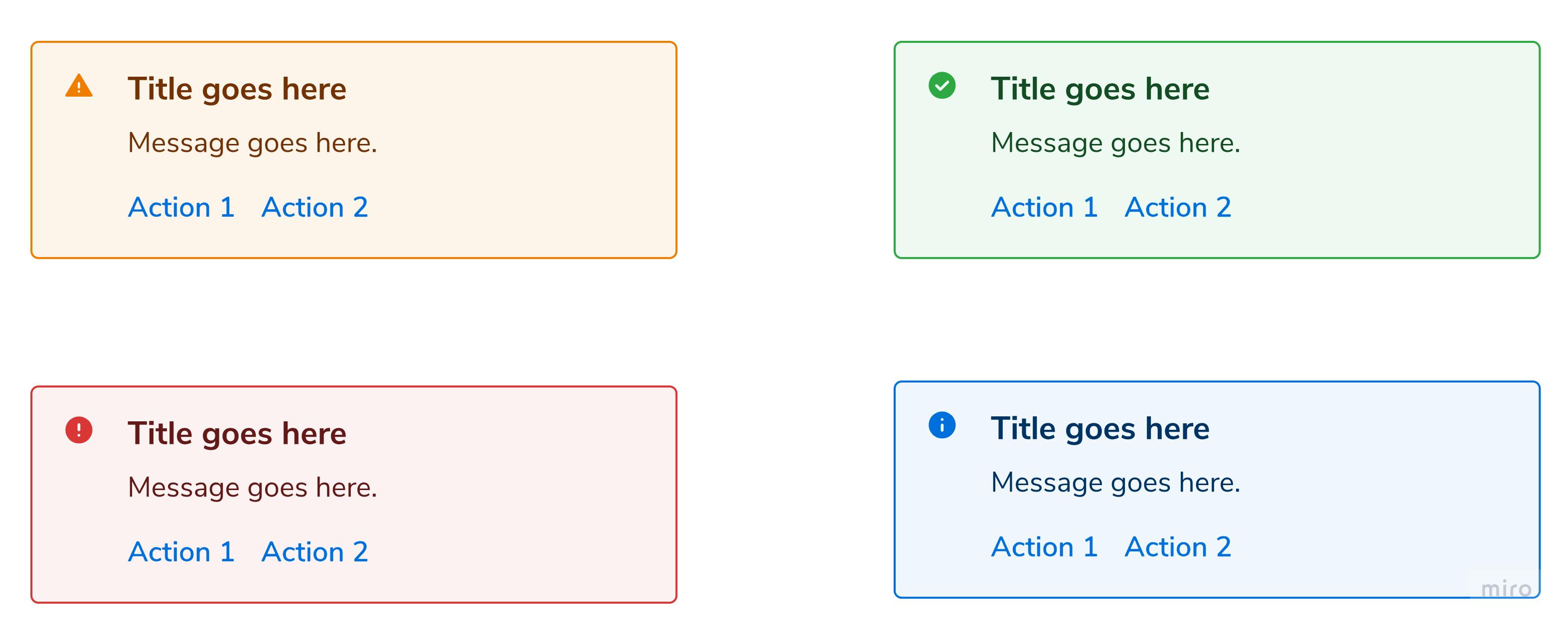
Consider creating an Alert component which looks something similar to this:

Let's first break down the entire component into smaller subcomponents.

The Alert component consists of the following subparts:
Title
It can be a
stringor may be optionalMessage
Message can consist of multiline text or any other component. So we can fix its type to
string | ReactNodeAction buttons
It consists of any component where input from the user is required. It may consist of multiple buttons, or any other component or might be an optional field.
Its type is set to
ReactNode | undefinedIcon
We can define any icon to be shown.
Along with the icon name, its position also matters. There might be a case when we need to show the icon to the right.
The icon can also vary based on size.
Variants

The alert component can come under multiple variants and based on the type of variants colours, the font style of its subparts (title, message, icon) changes.
Patterns
As some of the subparts are optional in the Alert component and the user can also add its custom component, this will result in multiple patterns.

Now that we had go through all the requirements, let's move to the code part.
🎯 Configuration
In the Configuration approach, the user can pass data to the component via props, and the component should know exactly how to render itself based on that props.
Let's move with the above example of the Alert component and see how to design its API using a configuration approach.
const Alert = (props) => {
    const {
        title,
        description,
        actions,
        iconName,
        iconSize,
        iconPosition='left',
        iconColor,
        variant
    } = props;

    return (
        <div className={variantClass}>
          {iconName &&
            <Icon
              name={iconName}
              size={iconSize}
              position={iconPosition}
              appearance={iconColor}
            />
          }
          <div>
            {title && <Heading>{title}</Heading>}
            {message && <Paragraph>{description}</Paragraph>}
            {actions && (
              <div>{actions}</div>
            )}
         </div>
        </div>

    )
}

export default Alert;
Users can use this component using the following API:
<Alert
  title='Title goes here'
  description='Message goes here'
  variant='warning'
  iconName='warning_check'
  iconPosition='right'
  actions={
    <div>
      <Button>Action 1</Button>
      <Button>Action 2</Button>
    </div>
  }
/>
As you notice, for all the functionality user needs to pass a prop to the component but all the design decision and rendering is handled internally by the component.
📍 Pros:
Quick and easy to use. Different functionality and visual variants can be controlled by configuring props.
Configuration API via props makes it harder to diverge from the design system and keeps the UI and behaviour consistent.
📍 Cons:
Adding more features requires more props and conditional logic. Thus a component becomes harder to maintain.
Not easy to extend.
Not easy to override
If a component can't be extended, a new version might need to be built.
Using the above approach, the user does not need to worry about the design consistency across the app, they simply need to pass the prop to the component and all the design and visual aspects need to be handled by the component internally.
But it may be overhead as sometimes props provided by the component are not enough to satisfy all the use cases and the user may want some kind of customisation. Also for each functionality providing a different prop may to lead complex APIs which are not easy to extend.
Let's explore another approach for a similar use case.
🎯 Composition
In the Composition approach, Users should be able to take small building blocks and combine them together in whatever order they like.
Using this approach, the user is provided with multiple subcomponents which can be used in whatever order as per their use cases. Let's look at an example for better understanding.
<Alert variant='warning'>
    <Alert.Container>
        <Alert.Title>
            Title goes here
        </Alert.Title>
        <Alert.Description>
            <div>Hello World!!</div>
            <Badge>Description</Badge>
            <Paragraph>Short Description</Paragraph>
        </Alert.Description>
        <Alert.Action>
          <div>
            <Button>Action 1</Button>
            <Button>Action 2</Button>
          </div>
        </Alert.Action>
        <Alert.Icon name='warning_check' />
    <Alert.Container>
</Alert>
In the above code, instead of passing multiple props, the user can use smaller subcomponents for customisation. For example, Instead of passing a description as a string they can also pass a custom-designed description as per their use case. And also change the position of the icon to the right.
All these are just building blocks which are used to compose the functionality based on different use cases.
📍 Pros:
Extremely flexible
It's easy to create different functionality and UI variants and add new building blocks.
Makes a component library much more resistant to change
📍 Cons:
You need to compose the building blocks yourself to create a fully functioning component/feature.
Takes more time and code.
It's easy to diverge from the design system and ship inconsistent UI and behaviour.
🎯 Which Approach to use?
Both approaches as we see above have their advantages and disadvantages. Then the question is which one to use and when?
The approach you want to use totally depends on your use case and design pattern. There might be cases when we can use both approaches to satisfy our use case appropriately.
🎯 Summary
The Composition approach offers more flexibility, but it does require more knowledge of how to compose the building blocks and how they work.
On the other hand, the Configuration approach is less flexible, but it is simpler to use and makes it easier to stick to the design system.
🎯 Wrap Up!!
That's all for this article. Thank you for your time!! Let's connect to learn and grow together. LinkedIn Twitter Instagram

